PDP – Constellation
Posted: May 10, 2014 Filed under: Constellation Leave a commentDuring the first term of constellation, If I’m completely honest, I didn’t find particularly engaging , I’m personally a visual learner and I don’t like sitting and being talked at. My favourite lecture of the first term was definitely the ‘Reading and analysis’ lecture with Jonathan Clarkson. I like his way of teaching, he gets the class involved and keeps everyone engaged. During this session we were put in groups to do an activity which helped my learning as I enjoy listening to other people’s ideas as well as introducing my personal ideas to the group too. For the lectures I missed I went onto blackboard to catch up, I actually found it relatively easy to understand although it isn’t the same as physically being in the lecture itself, this has definitely taught me to attend every single lecture next year as using blackboard to catch up isn’t as enriching.
For my chosen lecture group, I was given my second option which was ‘After Modernism’ taught by Jonathan Clarkson. Admittedly I was gutted I didn’t get my first choice but seen as I enjoyed Jonathan Clarkson’s teaching the most I was happy to have him as my lecturer, I saw this as a positive as I was likely to learn the most in this option and be engaged to a maximum. Our group was very good at debating and I found it interesting hearing others student’s ideas of the subjects we were studying, although I am not one to talk aloud very often in lectures, I gained a great amount of information just from the other students themselves, they made me see art in a completely different light which I had never had before. All of the lectures were power point based, which usually I don’t find particularly engaging, however there were little to no words on the slides which meant that they were good for visual learners like me. In our lectures we looked at Abstract Expressionism, Pop Art, Fluxus and Minimalism. My favourite lecture was when we looked at fluxus; it was something which I wouldn’t ever look at as it’s very conceptual and my art doesn’t tend to be strongly like that, this meant that I found it challenging but in a positive way. What really stood out to me in the fluxus lectures was how the artists wouldn’t envision a final outcome, but the events that led up to it would mould the final piece, this meant the actually meaning of the work was the build-up rather than the outcome. After the lecture I was pretty sure that’s what I wanted to do for my constellation essay, I wanted to explore fluxus further as there is so much to it.
Overall I have found constellation a very enriching part of the course; it has opened my eyes to new concepts and ideas. I have found it very challenging as art history has never been my strongest area, I can get easily distracted and bored like I did in the first term, but during the second term this has completely changed. I feel like the second term constellation lectures have helped me in preparation for second year where we have to do more extensive research. Thanks to my lectures I want to create more conceptual art work in the future.
Final Piece
Posted: May 6, 2014 Filed under: Field Personal Leave a commentThis is my final piece I created in my painting workshop, we layered shades of green and painted on top, we could use the colours red, white, blue, yellow and green. My piece was from my favourite graffiti that I took when exploring Cardiff’s street art. Using the greens gave my piece a completely different tone to the actual graffiti, it makes look more abstract and expressive.
Before cut out:

After cut out:

Group presentation (LINK)
Posted: May 5, 2014 Filed under: Field Group Leave a commentFollow the link below for our field group presentation
Field Reflective Writing
Posted: May 5, 2014 Filed under: Field Personal Leave a commentI have found this project to be very rewarding, working in a group was something new to me but it benefited my work in many ways, everyone was able to input their ideas and help each other out, hearing what other people had to say opened my eyes to new things I wanted to try. My group ended up creating a mosaic, and as I’m used to working mainly in paint, this opened me up to working in new media.
My individual city project was very different to my time project in terms of media used, and this was certainly inspired by working in new media within my field group. A lot of the work was done in Photoshop which was a change for me, so my final piece became graphic based. I am extremely happy with my outcome, the two print outs I created sum up my project well. We can compare and contrast the colours within the two prints and can easily differentiate the emotions portrayed in both due to the colour palettes. I also created prints and collages as back up work which is also a media I very rarely used. If I had more time I would have loved to experiment with other kinds of print – rather than just mono print. As a lot of my work was Photoshop based, it was very time consuming as I was working with elements on Photoshop I had never used before, this meant I was unable to produce as much work as I would have liked.
My main strength throughout the field project was being able to experiment with new media and being able to work successfully in a group. If I was to change anything within the project I would have managed my time more successfully to produce a wider range of work.
Final Piece
Posted: May 5, 2014 Filed under: Field Personal Leave a commentI printed out my final piece onto A1 glossy paper, I wanted them large so they would represent the monumental size of the building. I presented the final piece so that the duller building was on the top, this meant you would look at it first then you would then follow your eyes down to the brighter building, doing this means that you will see a bigger contrast. The contrast between them is important as my final piece is looking at how graffiti on a building is more aesthetically pleasing than outdated buildings. The first print is made from the average colour of each of the photos I took of these outdated 20th century buildings and the second is the average colours found in the photos I took of buildings with graffiti on. I am very happy with my final piece as there is clear contrast between both prints and obvious which is more eye-catching and appealing.

Final Piece
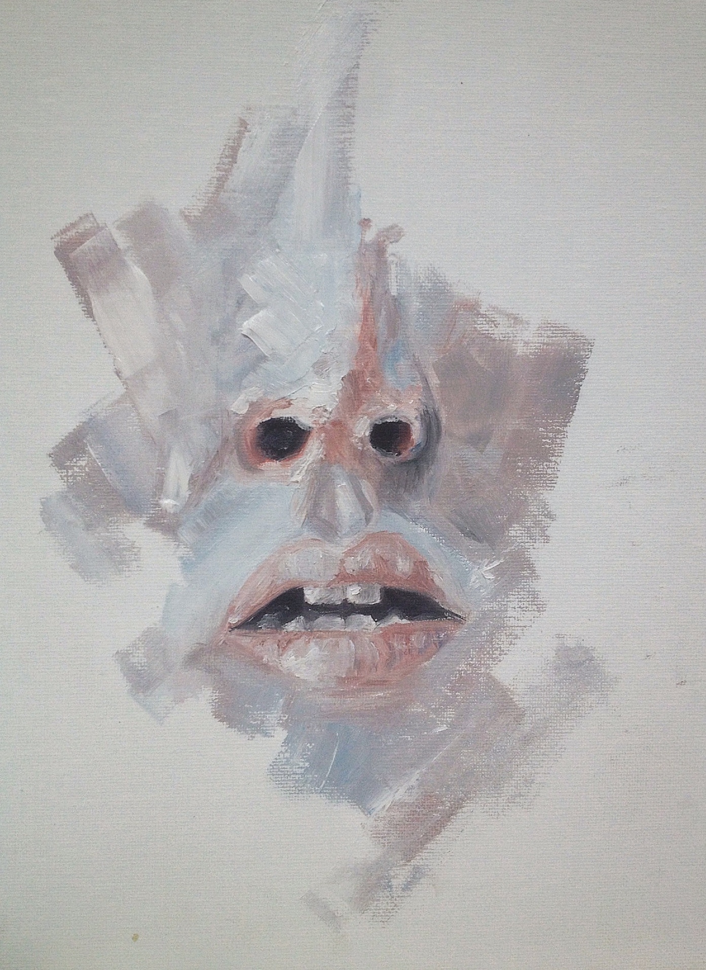
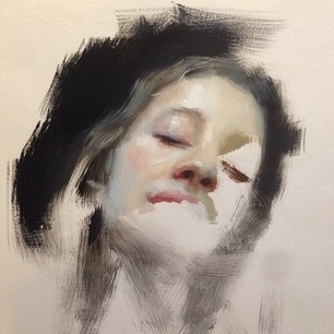
Posted: May 4, 2014 Filed under: Time Project Leave a commentThrough my development i have found that blurring the faces are successful, I really liked the the recent sketches I did and wanted to create a similar effect but in paint. I used oil paints on board to do this, I used a monotone colour palette to reflect the ‘unknow’ emotion. I love the effect that is created here, it’s abstract and it’s almost not identifiable as a face at all – this represents the idea of people wearing ‘masks’ out in public to hide emotions.

Final Piece
Posted: May 1, 2014 Filed under: Time Project Leave a commentFor my second final piece i created an oil painting on a 50x50cm canvas. My inspiration for this piece was Henrik Uldalen. I created this piece from a photo I took, the subject of the picture was completely unaware i was taking the picture, the subject is yawning but can we tell what emotions he’s feeling, no. This is why I used the same techniques used by Uldalen, the face hasn’y=t been fully painted to represent the hidden emotion capture in the moment where i took the photo.

Henrik Uldalen inspired paintings
Posted: May 1, 2014 Filed under: Time Project Leave a commentHere are 2 paintings i created inspired by Henrik Uldalen, I used the same technique as he has by not having the full face painted – this represents somebody not showing all their emotion, like the people we see day-to-day in the street, we cannot tell what people are feeling inside in that split second we see someone we don’t know in public. I used the same colour palette as Uldalen uses, the colour palette is cool rather than warm, and it isn’t vibrant which conveys the ‘unknow emotions’ in someones face. I used photos of my own, the subjects are unaware of the photo being taken.

Henrik Uldalen
Posted: May 1, 2014 Filed under: Time Project Leave a commentI came across an artists in the Saatchi website who’s work really caught my eye, he used cool colours with the same very colour palettes in all his paintings. The pieces of work that inspired me were the ones where all the face wasn’t painted – this reminded me of people of truly being ‘fully there’. His work has influenced me to further my project ideas. As i began looking at people putting on a ‘mask’ in public and people not showing their emotions, Uldalen’s work links to what I am looking at, the fact the subjects face isn’t fully there conveys hidden identity.


Recent Comments